Version: 5.x
vm-tooltip
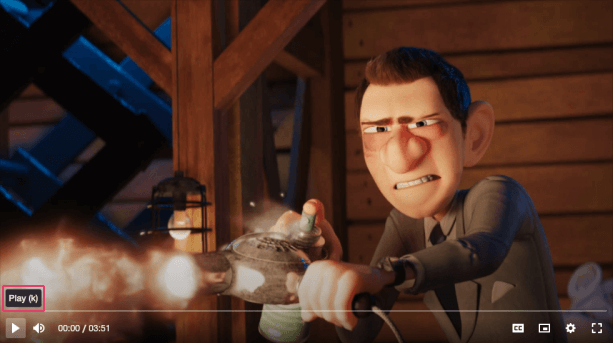
A small pop-up box that appears when a user moves their mouse over an element. Their main purpose is to provide a description about the function of that element.
Visual#

Usage#
- HTML
- React
- Vue
- Svelte
- Stencil
- Angular
example.vue
example.svelte
example.html
Properties#
| Property | Description | Type | Default |
|---|---|---|---|
active | Whether the tooltip is visible or not. | boolean | false |
direction | Determines if the tooltip should grow according to its contents to the left/right. By default content grows outwards from the center. | "left" ∣ "right" ∣ undefined | undefined |
hidden | Whether the tooltip is displayed or not. | boolean | false |
position | Determines if the tooltip appears on top/bottom of it's parent. | "bottom" ∣ "top" | 'top' |
Slots#
| Slot | Description |
|---|---|
| Used to pass in the contents of the tooltip. |
CSS Custom Properties#
| Name | Description |
|---|---|
--vm-tooltip-bg | The background color of the tooltip. |
--vm-tooltip-border-radius | The border radius of the tooltip. |
--vm-tooltip-box-shadow | The box shadow cast around the tooltip. |
--vm-tooltip-color | The text color of the tooltip. |
--vm-tooltip-fade-duration | The length in seconds that the tooltip will take to fade in/out. |
--vm-tooltip-fade-timing-func | The transition timing function for fading in and out. |
--vm-tooltip-font-size | The font size of the tooltip text. |
--vm-tooltip-left | The left offset of the tooltip. |
--vm-tooltip-padding | The padding inside the tooltip. |
--vm-tooltip-spacing | The space between the tooltip and its parent when active. |
--vm-tooltip-z-index | The position in the UI z-axis stack inside the player. |
