
Version: 5.x
vm-menu-item
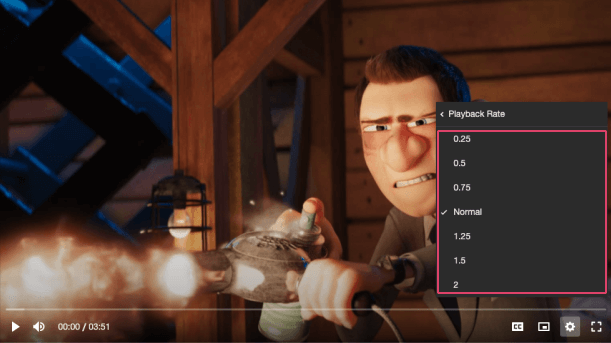
A collection of radio buttons describing a set of related options. Only one radio button in a group can be selected at the same time.
Visual#
Usage#
- HTML
- React
- Vue
- Svelte
- Stencil
- Angular
example.vue
example.svelte
example.html
Properties#
| Property | Description | Type | Default |
|---|---|---|---|
badge | This can provide additional context about the value of a menu item. For example, if the item is a radio button for a set of video qualities, the badge could describe whether the quality is UHD, HD etc. If hint is shown, badge is not shown. | string ∣ undefined | undefined |
checkIcon | The name of the checkmark icon to resolve from the icon library. | string ∣ undefined | 'check' |
checked | If this item is to behave as a radio button, then this property determines whether the radio is selected or not. Sets the aria-checked property. | boolean ∣ undefined | undefined |
expanded | If the item has a popup menu, this indicates whether the menu is open or not. Sets the aria-expanded property. | boolean ∣ undefined | undefined |
hidden | Whether the item is displayed or not. | boolean | false |
hint | This can provide additional context about some underlying state of the item. For example, if the menu item opens/closes a submenu with options, the hint could be the currently selected option. If checked is defined, hint is not shown. | string ∣ undefined | undefined |
icons | The name of an icon library to use. Defaults to the library defined by the icons player property. | string ∣ undefined | undefined |
identifier | The id attribute of the item. | string ∣ undefined | undefined |
label (required) | The label/title of the item. | string | undefined |
menu | If the item has a popup menu, then this should be a reference to it. | HTMLVmMenuElement ∣ undefined | undefined |
Methods#
| Method | Description | Signature |
|---|---|---|
blurItem | Removes focus from the menu item. | blurItem() => Promise<void> |
focusItem | Focuses the menu item. | focusItem() => Promise<void> |
getHeight | Returns the height of the menu item. | getHeight() => Promise<number> |
Events#
| Event | Description | Type |
|---|---|---|
vmBlur | Emitted when the item loses focus. | CustomEvent<void> |
vmFocus | Emitted when the item is focused. | CustomEvent<void> |
CSS Custom Properties#
| Name | Description |
|---|---|
--vm-menu-item-arrow-color | The color of the left/right arrow on a navigational menu item. |
--vm-menu-item-badge-bg | The background color of the badge. |
--vm-menu-item-badge-color | The color of the badge text. |
--vm-menu-item-badge-font-size | The font size of the the badge text. |
--vm-menu-item-check-icon-size | The width of the checked icon. |
--vm-menu-item-divider-color | The color of the divider between a navigational menu item and the menu body. |
--vm-menu-item-focus-bg | The background color of a menu item when it is being focused or hovered on. |
--vm-menu-item-focus-color | The color of a menu item's text when it is being focused or hovered on. |
--vm-menu-item-hint-color | The color of the hint text. |
--vm-menu-item-hint-font-size | The font size of the hint text. |
--vm-menu-item-hint-opacity | The opacity of the hint text. |
--vm-menu-item-padding | The padding within each menu item. |
--vm-menu-item-tap-highlight | The highlight color when a menu item is tapped. |