
Version: 4.x
vime-slider
A custom styled and ARIA friendly input[type="range"] component for inputting numeric values.
In addition, there are optimizations made for improved touch support (more information can be found
at https://github.com/sampotts/rangetouch).
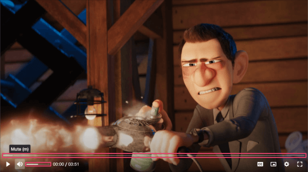
Visual#
Usage#
- HTML
- React
- Vue
- Svelte
- Stencil
- Angular
example.vue
example.html
example.ts
Properties#
| Property | Attribute | Description | Type | Default |
|---|---|---|---|---|
label | label | A human-readable label for the purpose of the slider. | string ∣ undefined | undefined |
max | max | The greatest permitted value. | number | 10 |
min | min | The lowest value in the range of permitted values. | number | 0 |
step | step | A number that specifies the granularity that the value must adhere to. | number | 1 |
value | value | The current value. | number | 5 |
valueText | value-text | Human-readable text alternative for the current value. Defaults to value:max percentage. | string ∣ undefined | undefined |
Events#
| Event | Description | Type |
|---|---|---|
vValueChange | Emitted when the value of the underlying input field changes. | CustomEvent<number> |
CSS Custom Properties#
| Name | Description |
|---|---|
--vm-slider-thumb-bg | The background color of the slider thumb. |
--vm-slider-thumb-height | The height of the slider thumb. |
--vm-slider-thumb-shadow | The shadow cast around the slider thumb. |
--vm-slider-thumb-width | The width of the slider thumb. |
--vm-slider-track-color | The color of the track. |
--vm-slider-track-focused-height | The height of the track when it is focused. |
--vm-slider-track-height | The height of the track. |
--vm-slider-value-color | The color of the part of the track filled upto the current value. |
Dependencies#
Used by#
Graph#
Built with StencilJS